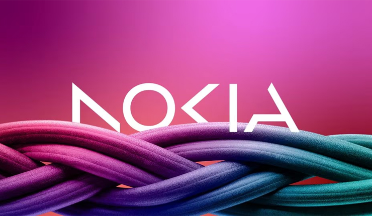
Telecom equipment maker Nokia has announced on Sunday the changing of its iconic logo for the first time in 60 years, revealing a new logo with five different shapes forming the word NOKIA with different colors.
The logo change marks the recent shift in the company’s strategy, which was put into action since CEO Pekka Lundmark took over in 2020.
The strategy has three stages; reset, accelerate and scale, for the reset stage is now complete, Lundmark said the second stage is beginning.
“We had very good 21 percent growth last year in enterprise, which is currently about eight percent of our sales, which is $2.11 billion, we want to take that to double digits as quickly as possible,” Lundmark stated.
Nokia is currently aiming to grow its business in service providing, as it sells equipment to telecom companies and is focusing on selling gear to other businesses.
Nokia plans to review the growth path of its different businesses and consider alternatives, including divestment, according to Reuters.
The company’s new direction towards factory automation and datacenters would have them be in a rivalry with other major companies like Microsoft and Amazon.
“There will be multiple different types of cases, sometimes they will be our partners, sometimes they can be our customers, and I am sure that there will also be situations where they will be competitors,” Lundmark added.
Major tech companies have partnered with telecom gear makers like Nokia to sell private 5G networks and gears for automated factories to customers, most of them in the manufacturing sector.
The telecom gear market has been under pressure, as high-margin markets like North America is being replaced by growth in low-margin markets like India, which recently pushed Ericsson to lay off 8,500 employees.


