
Pepsi unveils new revamped logo
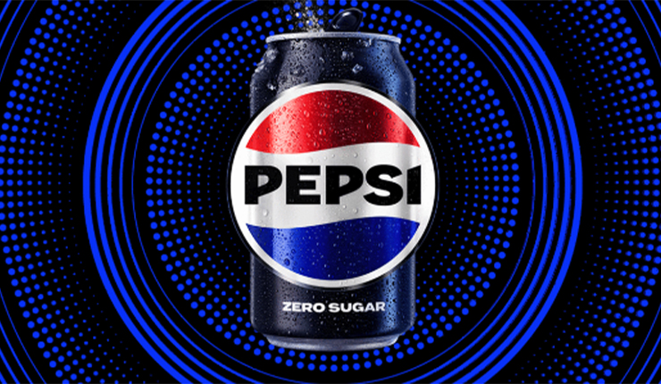
PepsiCo has unveiled on Wednesday its latest rebranded logo in 14 years, a revamped version of its 1990 logo, on the soft drink brand’s 125th anniversary, drawing on the brand’s history while focusing on its future.
The new logo draws inspiration from the 90s logo, with new modernised elements; a different font, font color and new border. The design not only has a sense of nostalgia, it also draws attention to Pepsi’s zero sugar line.
“The new logo, with its punchy, uppercase “PEPSI” smack-dab in the middle of the circle, emblazoned across the white stripe undulating between the red and blue waves, showing the brand’s bold and confident aspect,” said Todd Kaplan, Pepsi’s chief marketing officer.
Pepsi has been shifting its attention to its zero sugar product, as consumers’ interest is shying away from full sugar soda. “Zero is going to be the center of the strategy for the Pepsi brand,” said Ramon Laguarta, PepsiCo CEO.
Pepsi has recently announced it is changing its zero sugar recipe during its Super Bowl commercial.